How Douyin (TikTok) Succeeds with User Experience and Product Development

Douyin (TikTok), China’s hottest video app, continues to gain attention, including a recent article that describes Douyin as the WeChat for luxury. The comparison is understandable. But as I discussed in a recent blog post, Douyin is different from WeChat in a number of ways. My recent post highlighted Douyin’s monetization opportunities for brands and examples of businesses that are capitalizing on Douyin’s popularity with Gen Z audiences. Today let’s take a closer look at Douyin’s user experience and approach to product development.
A number of elements influence a product’s life span. They include competition (with other social communities and digital properties), user focus (target audience, product features, and holistic user experience) and product development (process and approach). As a user experience designer, I am focused on discovering, designing, and scaling unique products and experiences that solve the needs of real people. Working alongside product managers and engineers, I help develop a sustainable business plan for businesses by analyzing competitive products, developing product strategies, and creating lovable experiences through iterative releases. That approach informs my assessment of Douyin.
Douyin competes as a social media community, not as a creative tool
From the beginning, Douyin has positioned itself as a social media tool rooted in short-form video whose aim is to achieve “user stickiness.” This approach is similar to Facebook, Instagram, or WeChat, which entered their markets with simple ideas and grew as social media communities.
Of course, social media in general is designed for communication. Users don’t want to spend a long time learning about how to use an app. The experience must be comfortable, intuitive, friendly, informative, and entertaining. As a social media app, Douyin:
- Makes it easy for users to create and share content such as individual pages and customized updates
- Provides clear instructions about its features
- Rewards users to challenge themselves to undertake tasks that boost their creativity
It will not surprise me if Douyin creates groups to attract people with similar interests.
User as the center of the experience
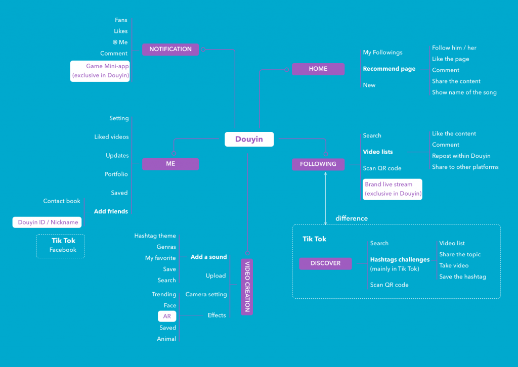
With users in mind, Douyin provides an experience where all features can be reached within three taps (as shown in the information architecture diagram below). In doing so, Douyin strikes a balance between ease of findability and a logical hierarchy for organizing information. The interface design intuitively adapts to user demands through scrolls and swipes.

Douyin has just made some updates since my last post, here I highlight the parts worth our attention:
- Brand Live Stream – direct monetizing approach for brands, currently it is only available on Douyin (not on Tik Tok yet)
- Game Mini-App – both mini-app and game lead very strong trends in China, which can be seen as signals that Douyin is expanding its platform capacity
- Douyin ID – Douyin is trying to gain its independence from other competing platforms by initiating its own ID system
- AR – Immersive technology engagement
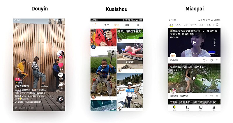
Additionally, the way Douyin presents information in a full-screen format is noteworthy. Compared to other short-form video apps in market, Douyin uses a full screen to create more immersive engagement, whereas other apps use a listing format. Full-screen content provides a different experience and an element of surprise and delight as users encounter new content without seeing a preview of what’s scrolling on their screens. Rather than having to make a choice about what to watch next, users are able to be surprised. This experience encourages engagement. Here is how Douyin content appears in full screen, as compared to other popular Chinese apps:

Image source: zcool.com.cn
Finally, with Douyin, there is no need to rotate the screen for video browsing, which simplifies the experience. I believe vertical screen is better for solo dancing/singing recording, especially in selfie mode.
Agile Product Development
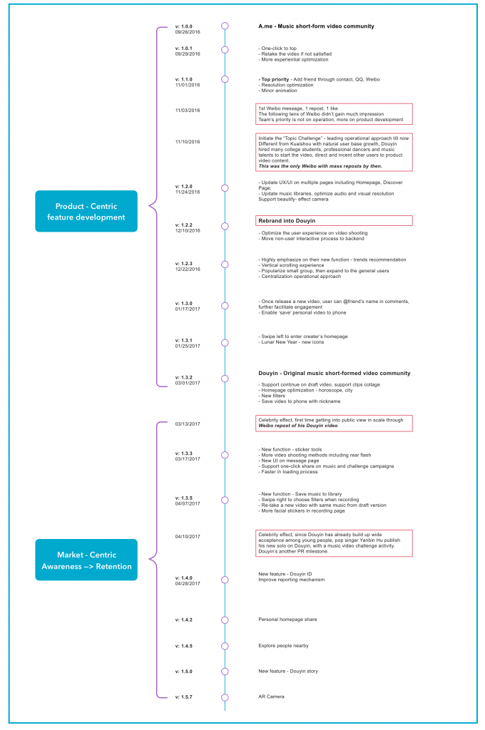
Douyin also distinguishes itself through the agile nature of its product development. Rather than wait until the app was perfected, Douyin launched its initial version and then began making rapid updates based on user feedback. This approach ensures that Douyin quickly assesses whether a certain feature is working and, if necessary, make adjustments quickly. By updating features quickly, Douyin ensures high levels of engagement and customer satisfaction. Agile development brings reduced risks, minimizes waste of time and budget, and improves ROI. You can get a sense of the agile nature of Douyin’s product development from the diagram below:

Source: woshipm.com
At Moonshot, we work with companies to create and scale lovable products in an agile fashion as Douyin does. We apply techniques such as agile development as part of an approach called FUEL (Future Unified Experience Lifecycle). The core value of FUEL is to launch lovable, scalable products with consistency, velocity, and collaboration between teams (design, development, product etc.) that achieves breakthrough customer-centric innovation. Through the combination of design thinking and lean innovation, we effect not only a product fit, but also a market fit with maximum positive result and least amount of investment. Contact Moonshot. We are here to help you discover, design, and scale products and experiences your customers will love.
