Designing the Right Metaphor for a Voice-First Experience

Embracing the voice-first world requires designers to conceive of new ways to research how people interact with devices. And sometimes those new ways have nothing to do with literal use of our voice.
In a recently published Mind the Product column, I discuss a research approach that we employed at Moonshot to begin designing an educational tool that relies on the voice interface. A client asked us to design a voice-based educational game for kids. Doing so meant that we needed to do some research with children to understand how they engage with voice assistants. We took two smart speaker concepts out into the field (homes where we could test ideas with kids) to give our research participants the opportunity to interact with something that might represent the product we were thinking about. While these were great tools to understand how children would react to the product we envisaged, we also wanted to learn about other potential approaches we weren’t thinking about. Put another way: the voice interface was the channel – but we needed a more creative way to envision the metaphor for how kids would interact with devices and learn.
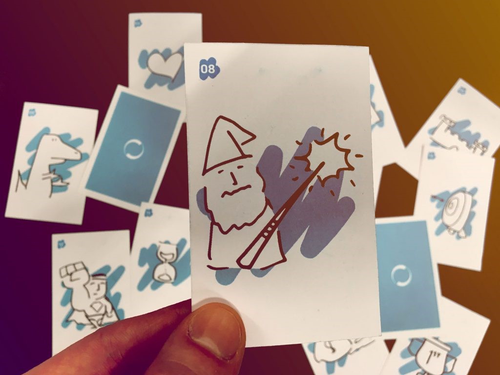
To help us broaden our thinking, we created a card deck to test the children’s reactions to a number of images. The deck consisted of 16 cards, each with a single image designed to represent some element that you might encounter when playing a digital game. The card deck was fun to use, and it came in very handy during our conversations with the children whose families had agreed to take part in the research. A two-hour conversation with a child about how they talk to a smart speaker is no simple task, so these cards brought something physical to an otherwise intangible experience. We asked the children to review the cards to familiarize themselves with the images. We told them that each card could represent whatever they wanted it to, so however they interpreted the card was correct, no matter what response they gave. This was probably my favorite part because the cards sometimes triggered unexpected replies.

You can’t design a useful and lovable experience by simply planting a device in front of an audience. It’s essential to connect with people through metaphors that resonate and inspire. For an audience of grown-ups we might have designed a completely different metaphor, perhaps in a video game format for an audience in their 20s. I invite you to read my post for more insight into the process we used and what we learned from interacting with kids.
Tools such as design sprints can help any organization test and learn with the right experience and metaphor in a way that keeps the audience at the center. To learn more, contact Moonshot. We’re happy to help you embrace a voice-first world.
